Attended and participated in Catalyst for Change on Saturday October 24th at [alt_] studios. Hosted and sponsored by the Design Museum of Chicago, [alt_] studios, Justice in Residence, and Mutuall Design. The event featured several non-profit organizations based in Chicago that focused on fostering community, supporting the youth, giving the previously incarcerated a fairer chance at job opportunities, and making Chicago a greener and more sustainable city.
Learn more about each at: e.a.t., Committee on Environmental Protection and Energy, Territory, and M.M.A.D.
The Event Format:
Individuals were split into different teams and were then randomly assigned a project brief by one of the organizations participating at the event. Each organization specializes in different forms of community aid, planning, and betterment. They all had differing briefs that required different deliverables from the participants. After finding my group and having everyone introduce themselves we were finally told what group we’d be creating work for. The group I was assigned to was e.a.t., an organization that aims to bring greater employment accessibility to those recently out of prison by bringing attention to legislation that is often overseen by companies when hiring. Their project brief described in detail their mission, their two target audiences being corporations and the Chicago community as a whole, as well as their main desire from the design sprint. They were looking for a few different possible deliverables which were highlighted as follows:
1 . Campaign Name, Tagline, and Messaging
Create a memorable campaign name and tagline that communicates the urgency of economic justice and corporate accountability. Teams may retain Fair Chance, Fair Economy or propose a stronger alternative. Develop a bold, direct message aimed at corporations and employers. How can your campaign challenge those in power while inspiring the public to demand change?
2. Logo and Brand Identity
Design a bold, cool, distinctive campaign logo that people would actually want to wear.
Think beyond traditional nonprofit branding. Explore hand-drawn artwork, expressive typography, illustrated symbols, or contemporary digital graphics. The identity should communicate worker power, economic justice, and solidarity while remaining recognizable across print, digital platforms, and merchandise.
Show your logo applied to at least one wearable item, such as a T-shirt, hoodie, or hat. The test: Would someone proudly wear this design even if they weren't attending a campaign event?
3. Creative Data Visualization
Transform at least one of EAT's campaign statistics into a provocative visual statement that captures attention and makes economic exclusion impossible to ignore. Consider how numbers, typography, scale, illustration, or unexpected comparisons can communicate the human impact of discriminatory hiring. Your design could take the form of a poster, graphic, or visual installation concept.
The challenge: Don't just display a statistic. Make people feel its significance and understand who has the power to change it
4. Optional Bonus: Experiential Campaign Activation
How could people experience this campaign in the real world?
Develop one creative activation that brings the campaign's message into public spaces and encourages participation. Consider where the activation would take place, who would participate, and what action people should take afterward. A storyboard, sketch, or simple mockup is sufficient. No physical prototype is required.
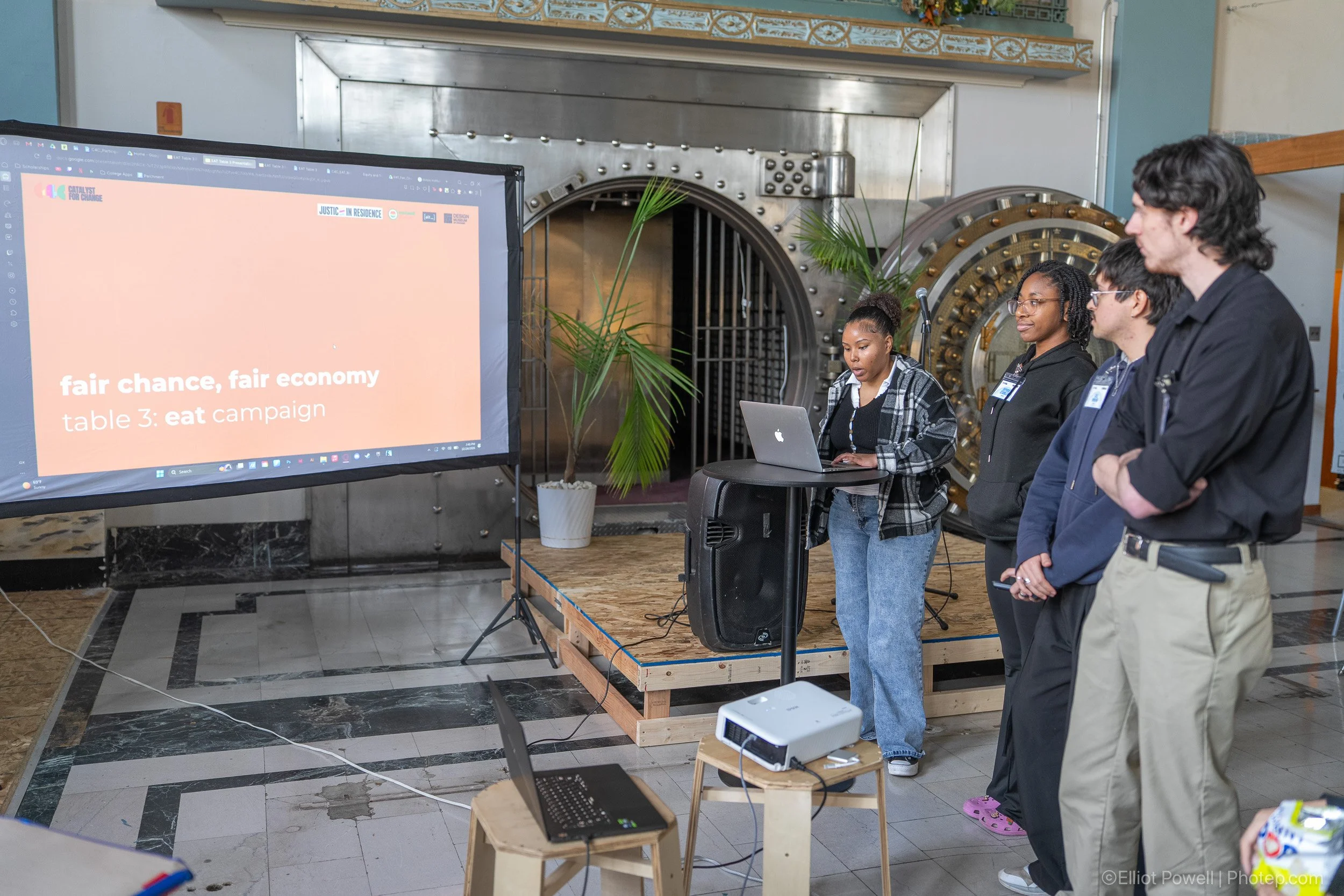
After much deliberation between my groupmates and myself we decided it would be best to tackle two primary deliverables alongside the bonus option. We put all of our attention and effort into deliverables number 1 and 3 focusing on the campaign name, tagline, and message, as well as creative data visualizations. Then we would figure out a possible experimental campaign activation if we had enough remaining time.
In total the design sprint would last for about two and a half hours. That’s 150 minutes to figure out a plan, create a campaign message, tagline, and name, create some visuals to go alongside said timeline, and still have time leftover to create a presentation to be able to showcase everything in one neat package to the judges. My team and I spent arguably too much time deciding exactly what our campaign message, tagline, and name would be, but in the end we settled on strong options that would work well with any kind of physical and digital poster, shirts, or website. Unfortunately it left us less time to create visuals or t-shirt mockups, something that the judges were specifically looking for. We did however come up with creative ways to be able to display the campaign not just to the general Chicago community but to companies as well.
After a quick lunch break teams began presenting what they were able to produce during the short design sprint. Each presentation worked the same way. Each team presets to a panel of judges comprised of two members and speakers from whichever organization your group is assigned to, as well as one professor from the Chicago area that teaches design. The presentations were maxed out at 5 minutes per group, something that quickly became difficult for most teams as there was a lot of info every team wanted to cover when it came to their thought process and final results. My team presented last after two other teams. In the end we presented quite well and the judges deliberated for quite a long time. Although we were unable to win in our group we did become finalists and I’m proud of the work I was able to create in such a short time alongside my group.
