Shifting the perspective on what it means to inform and create.
Innovative design that awes & informs.
Innovative design that awes & informs.
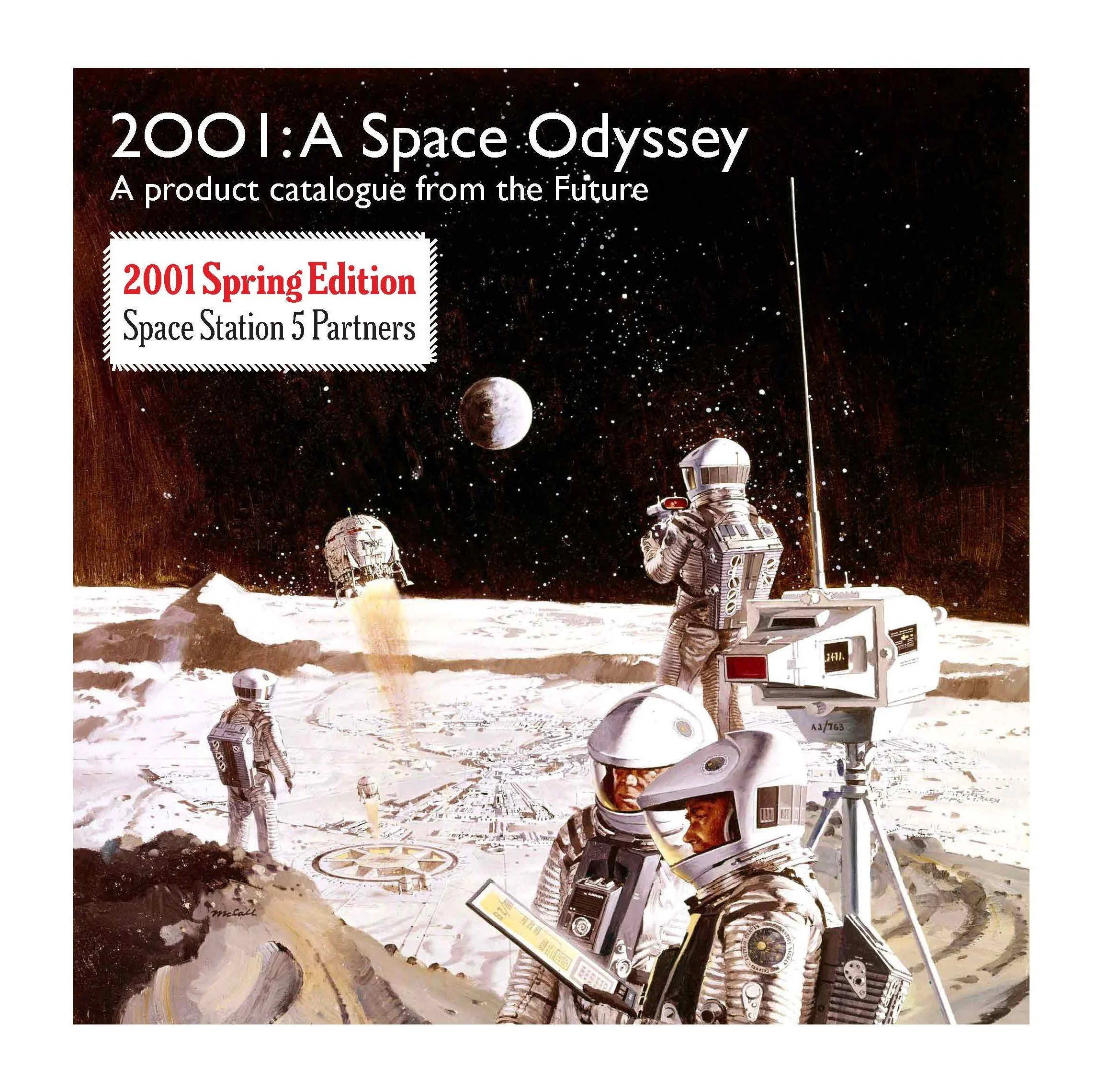
Director’s Cut Photobook Project.
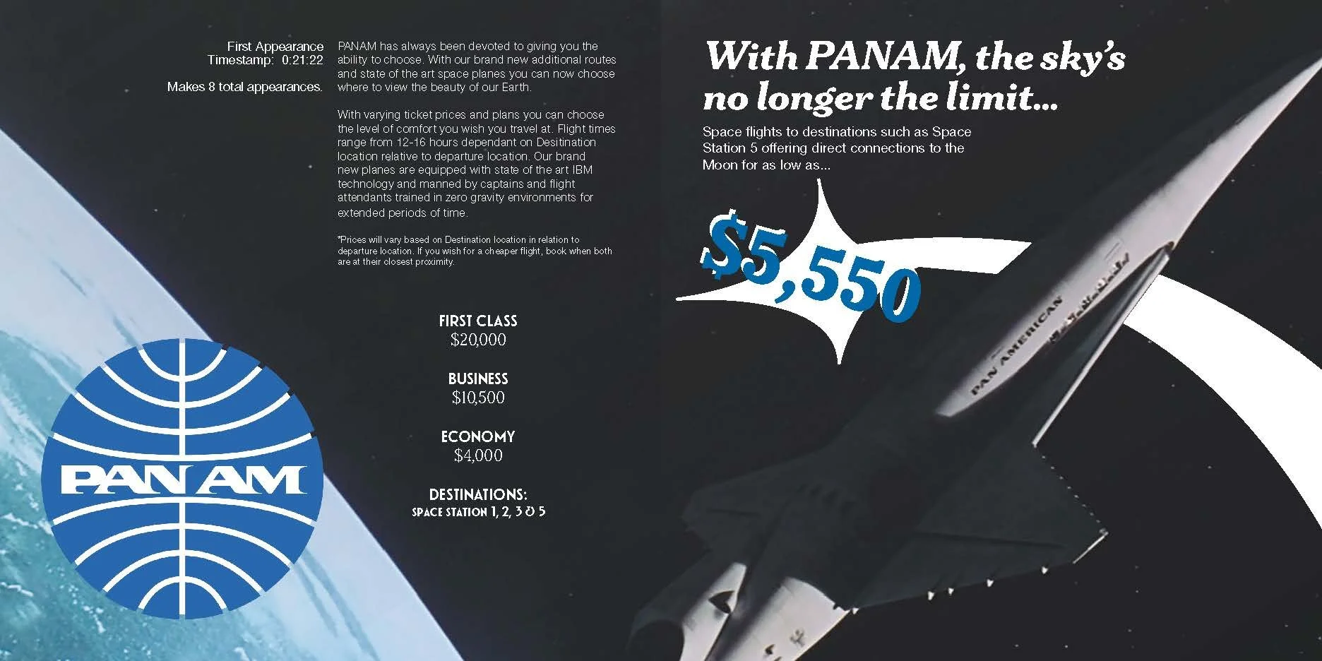
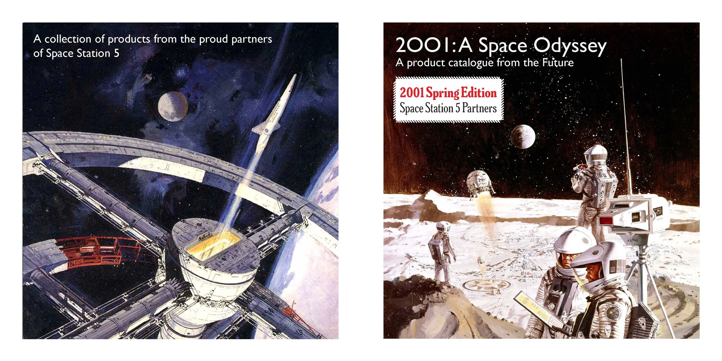
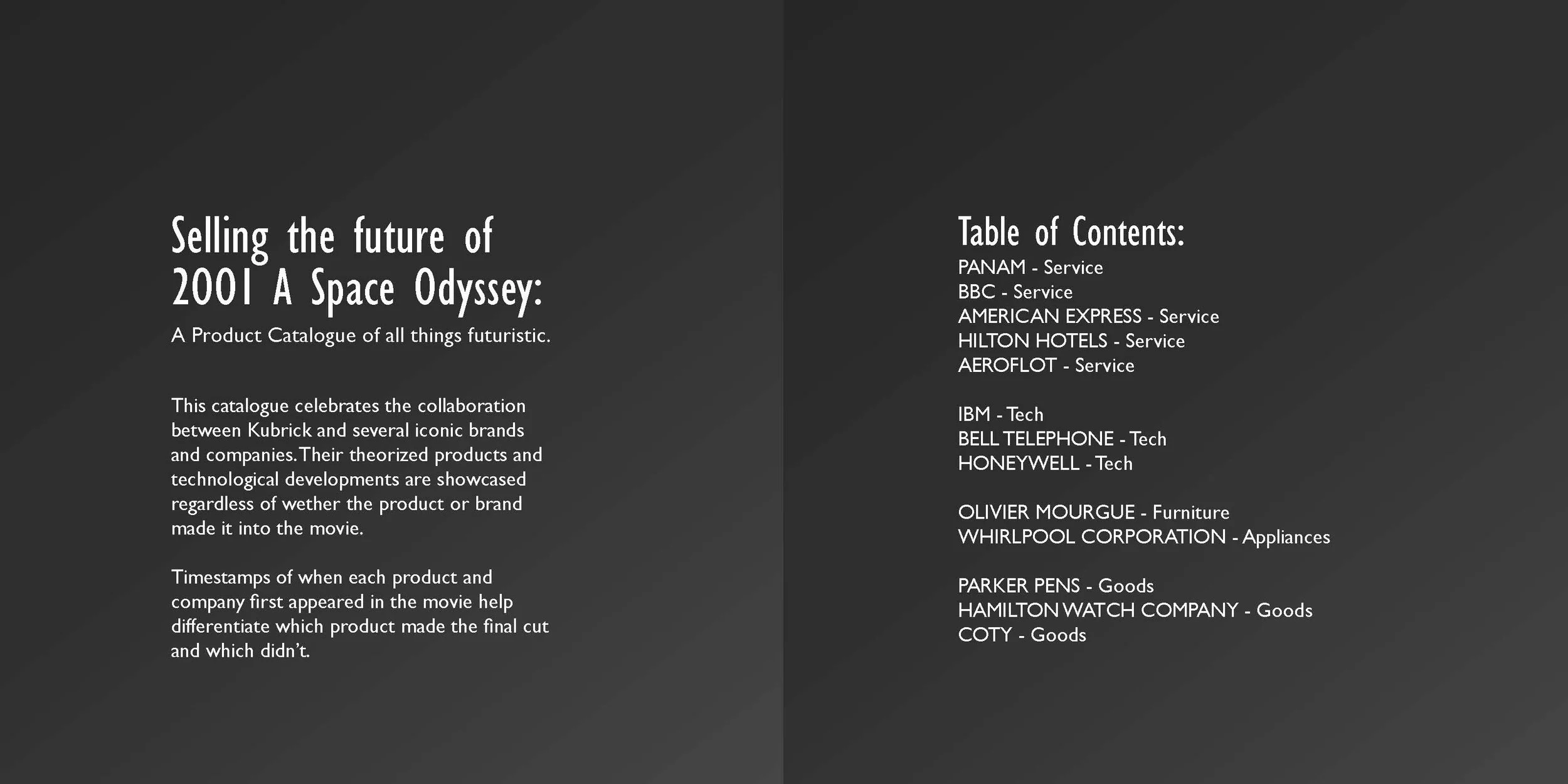
A 50 page book created with Stanley Kubrick’s 2001: A Space Odyssey at the forefront of inspiration and material source.
-
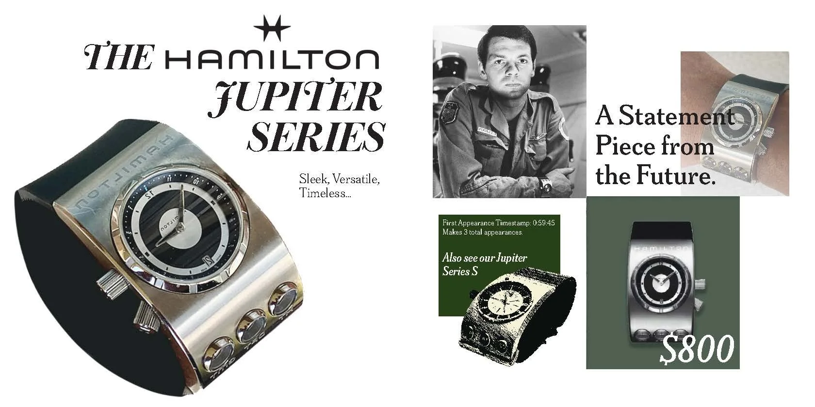
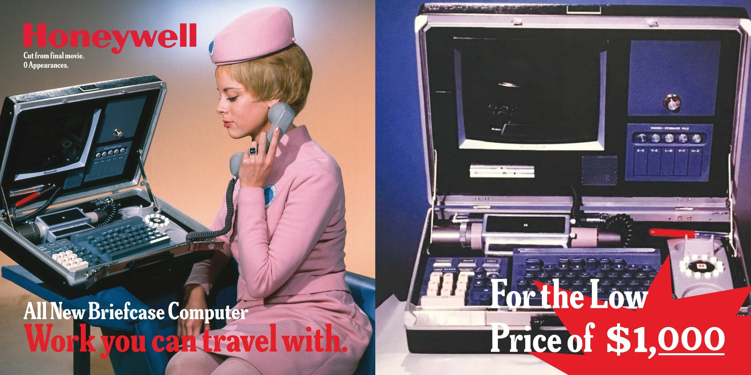
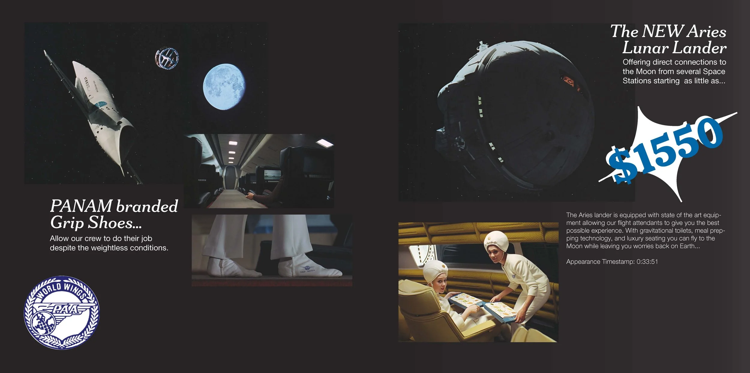
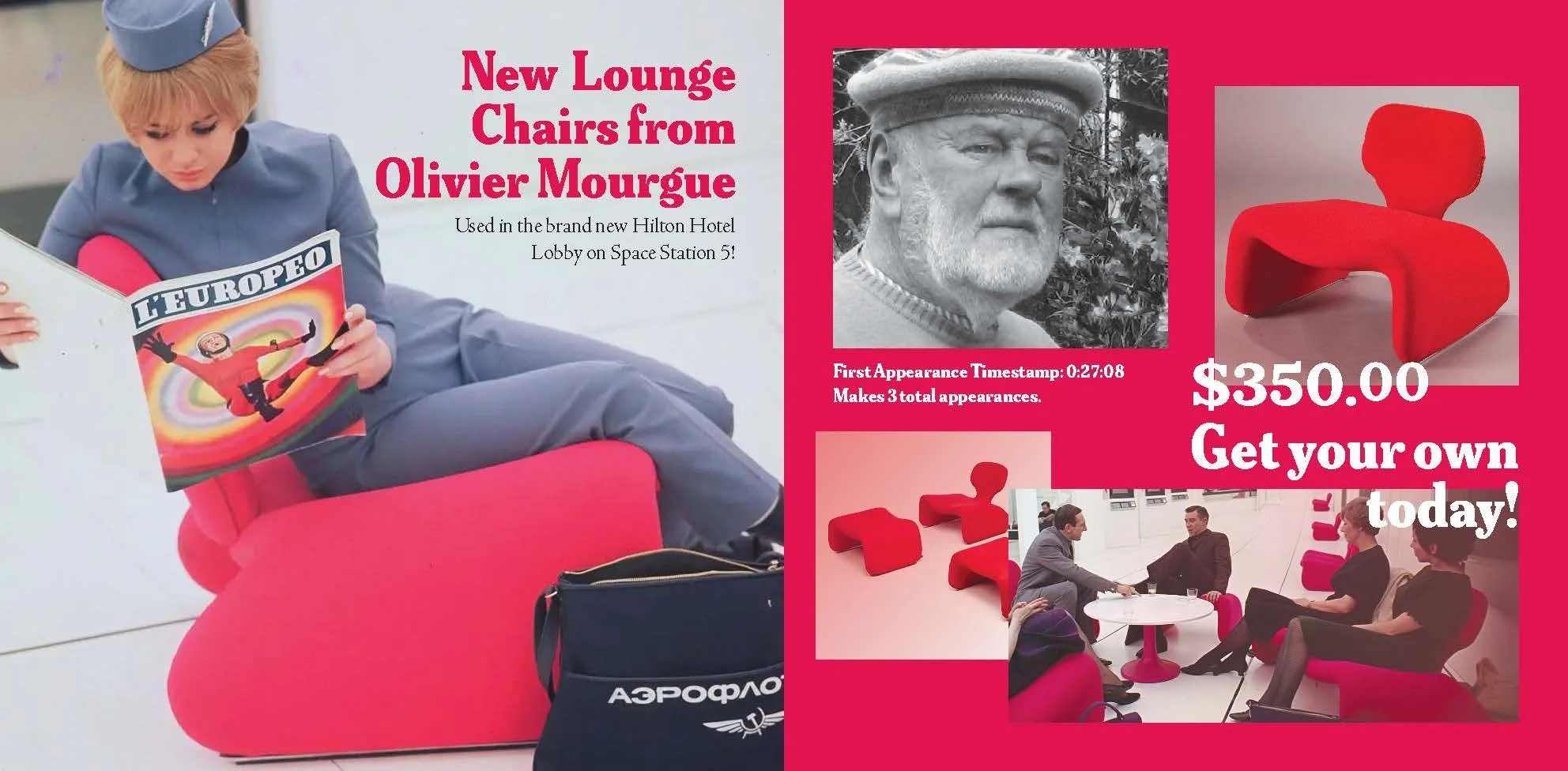
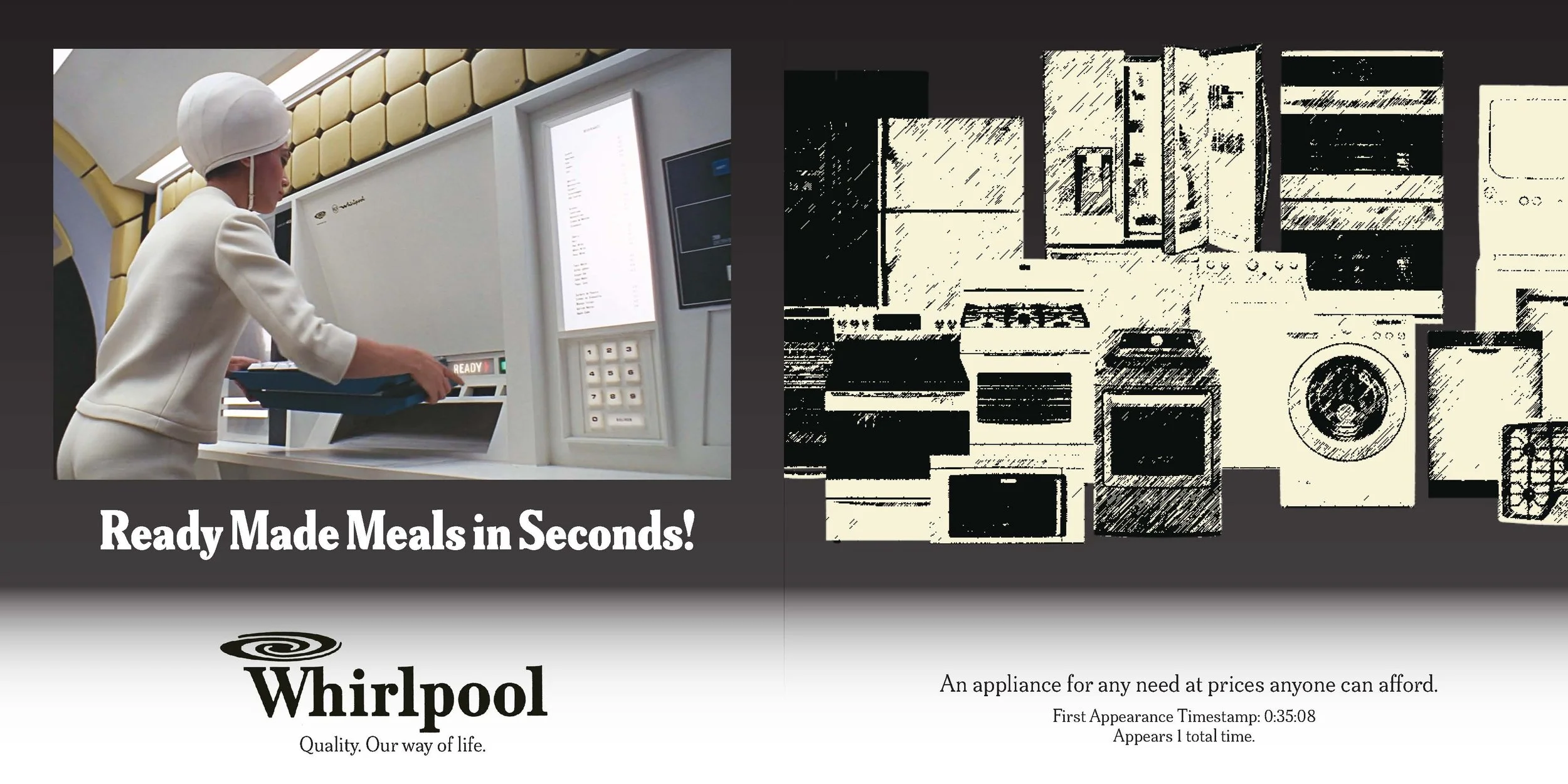
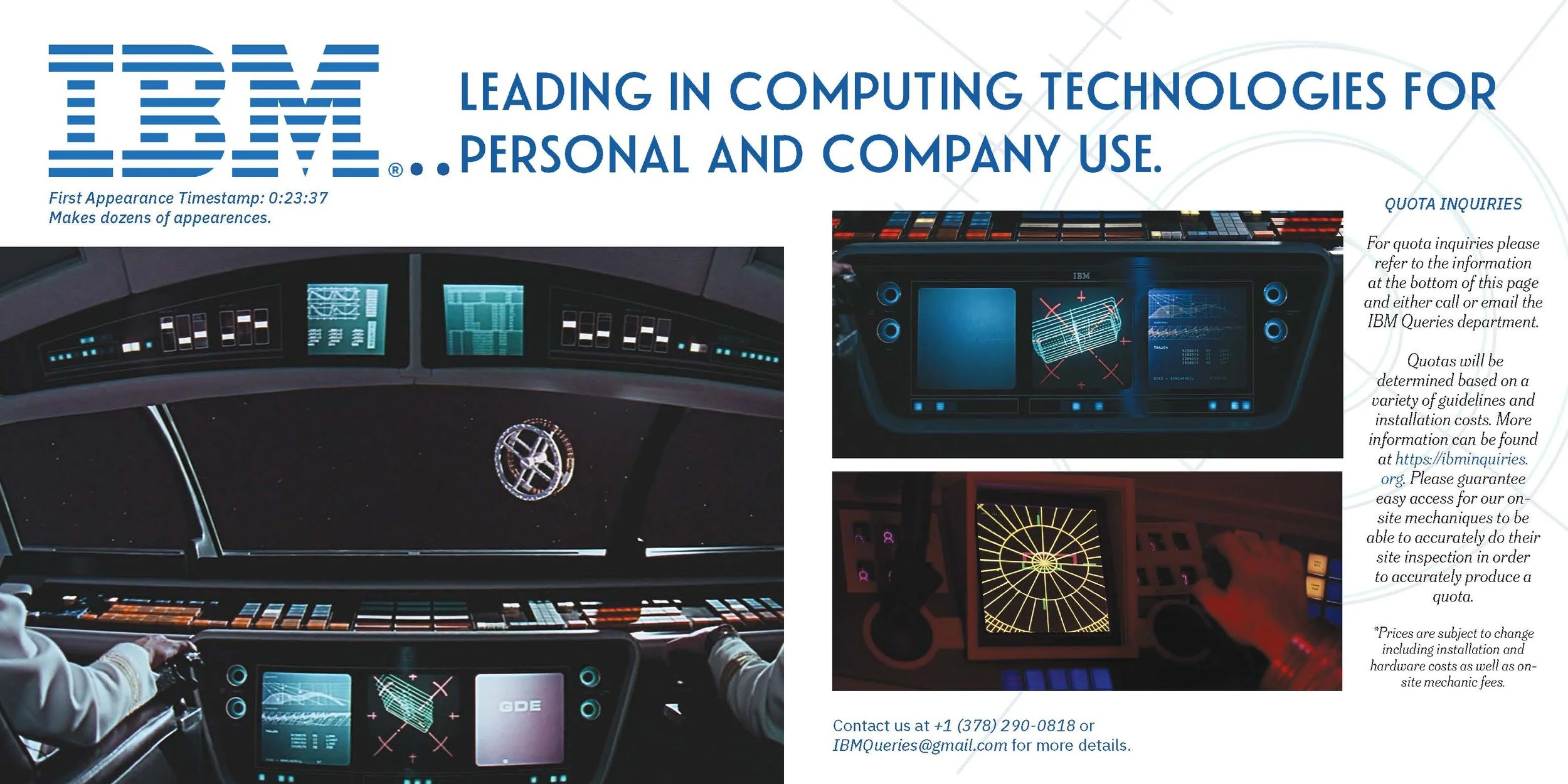
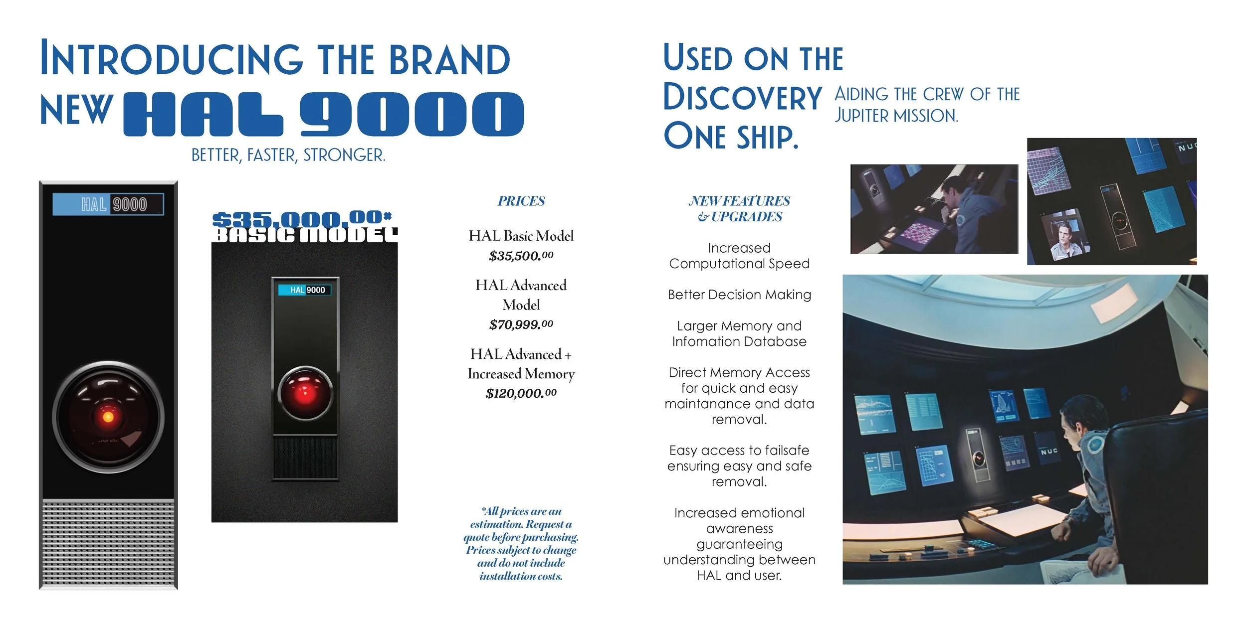
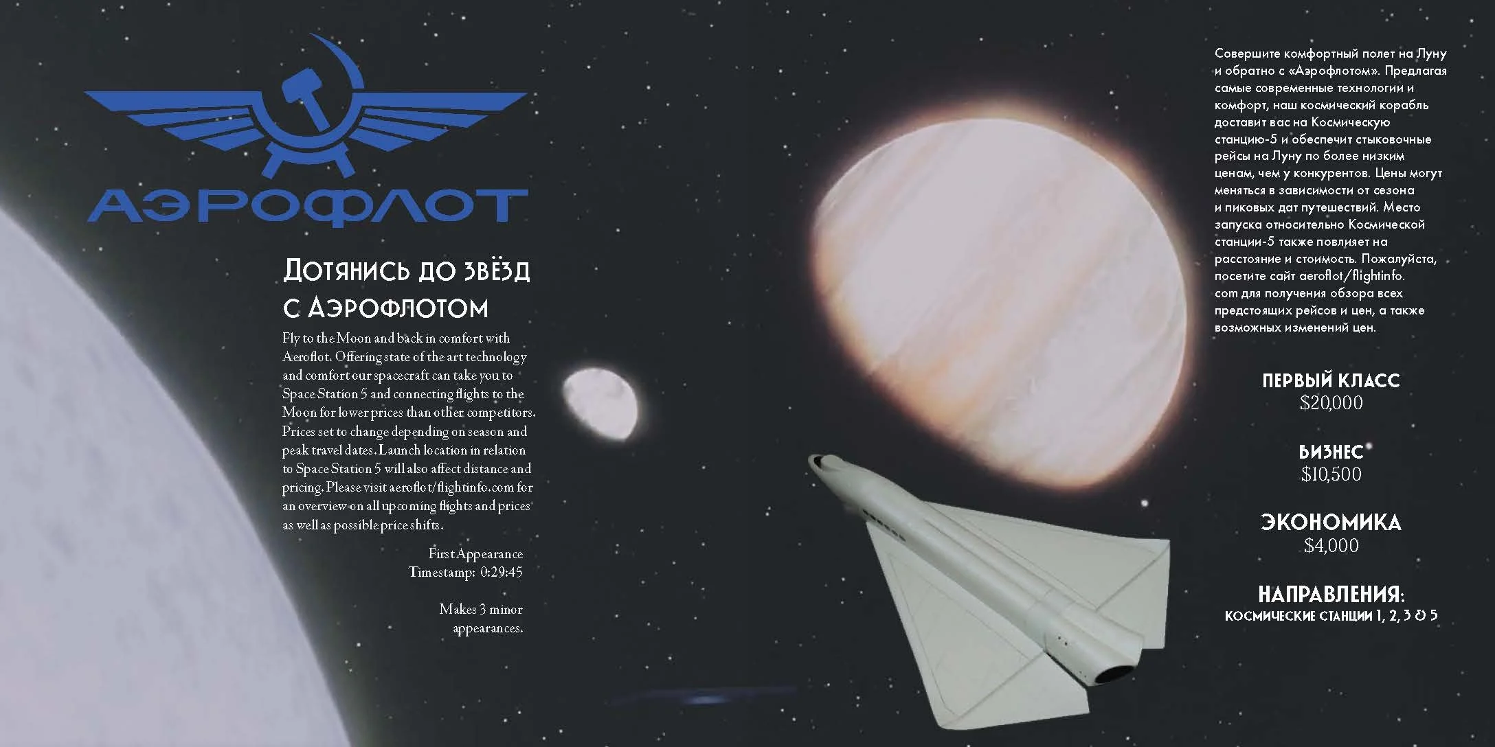
My process began by researching elements within 2001 that particularly stood out. I picked up on the fact that multiple companies had created faux products for the movies set design and decided that would be an interesting aspect to focus on by creating an advertisement magazine.
-
I began gathering images utilizing different sources including a huge collection of Stanley Kubrick’s own material that’s available at the London College of Communication while I was studying abroad there for a semester.
-
Finally I began laying out my images while trying to draw as much focus on the different fictional products these companies had designed, something that was rather difficult for some due to their limited screentime or use.
-
In the end the project which involved dozens of images and fonts each focused on giving each product and company their own aesthetic and identity was created into a fully bound 50 page magazine.
The Strokes Identity & Branding Project
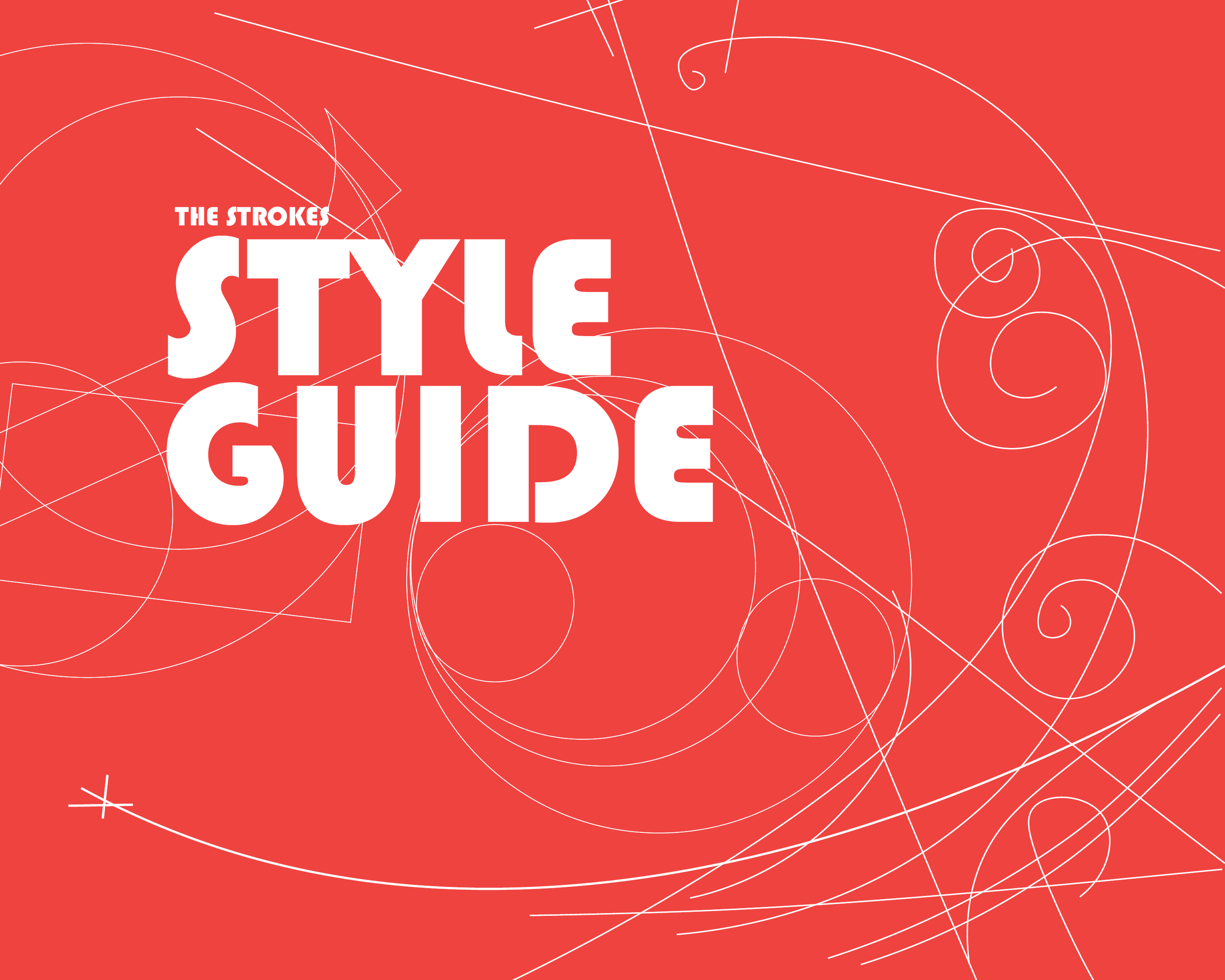
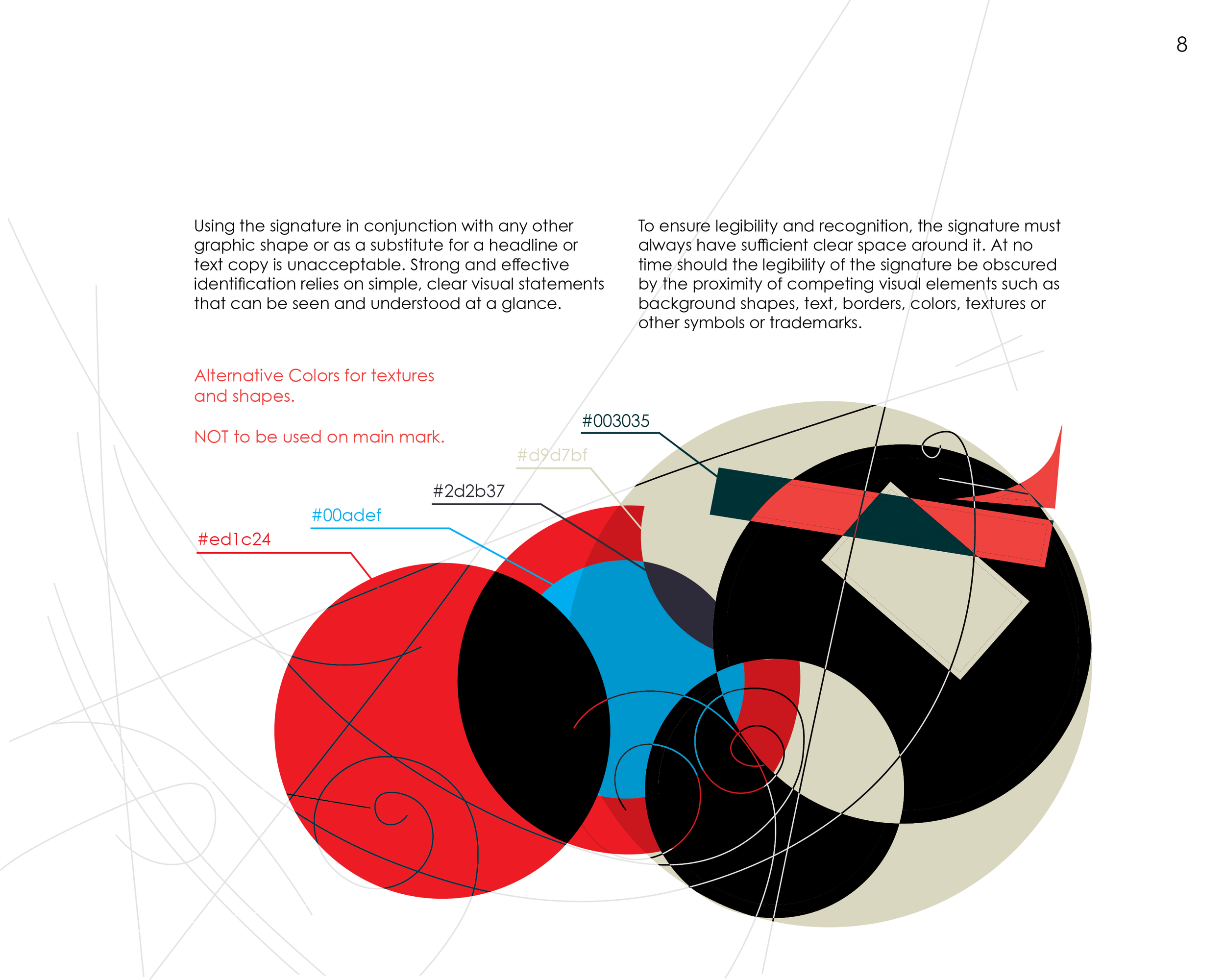
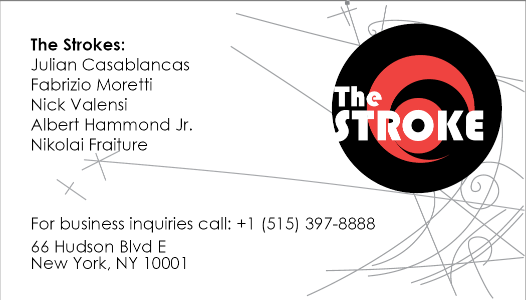
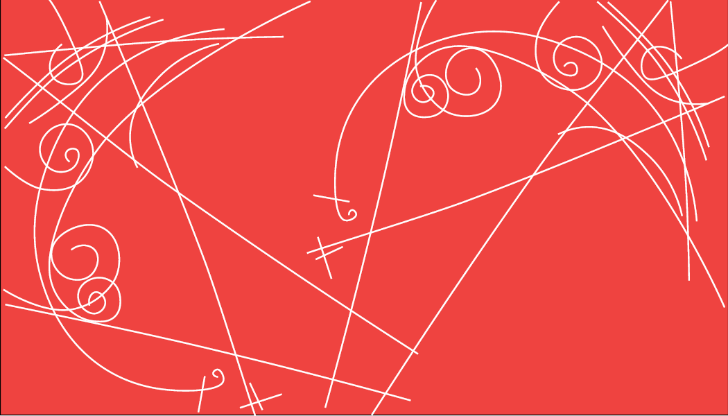
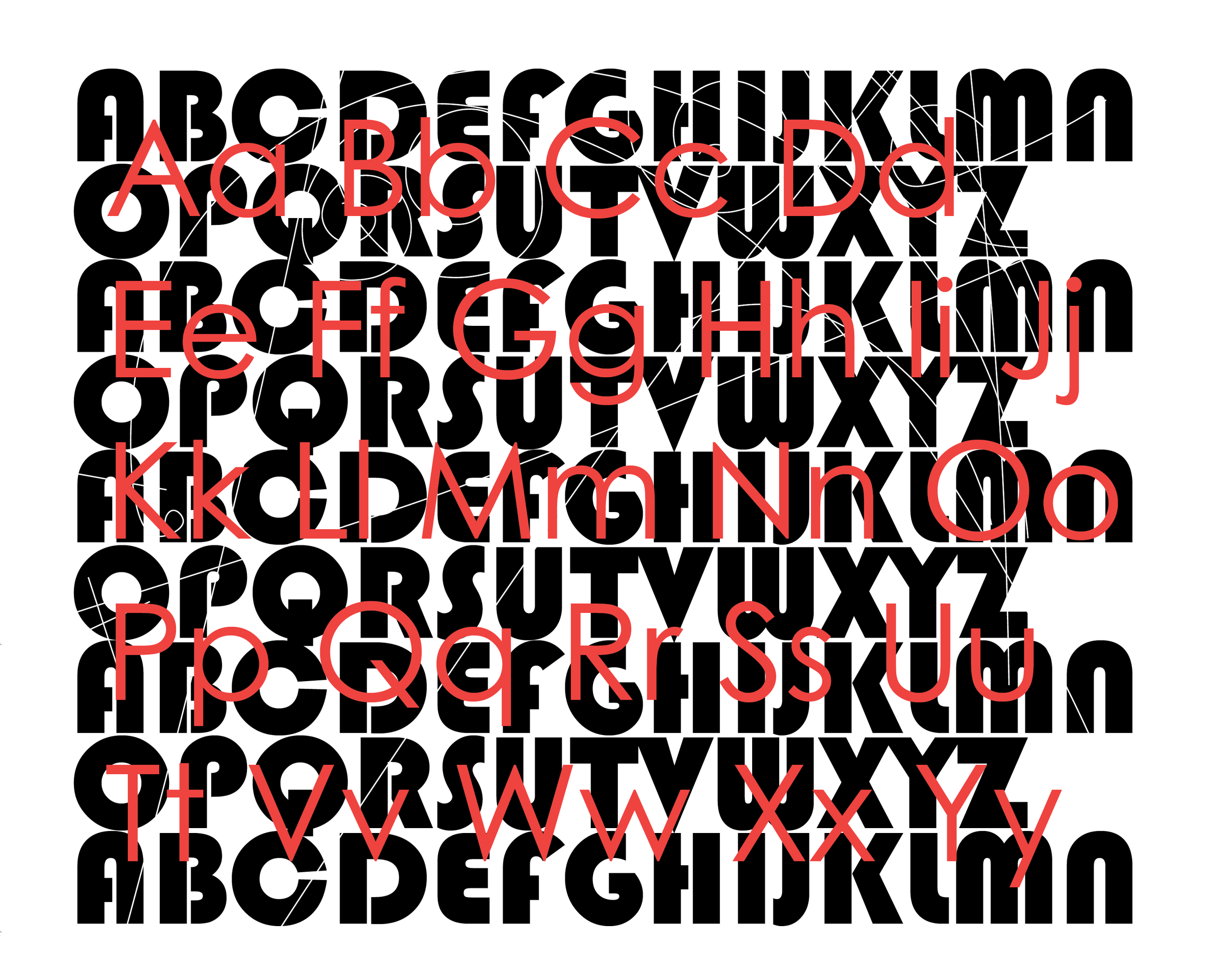
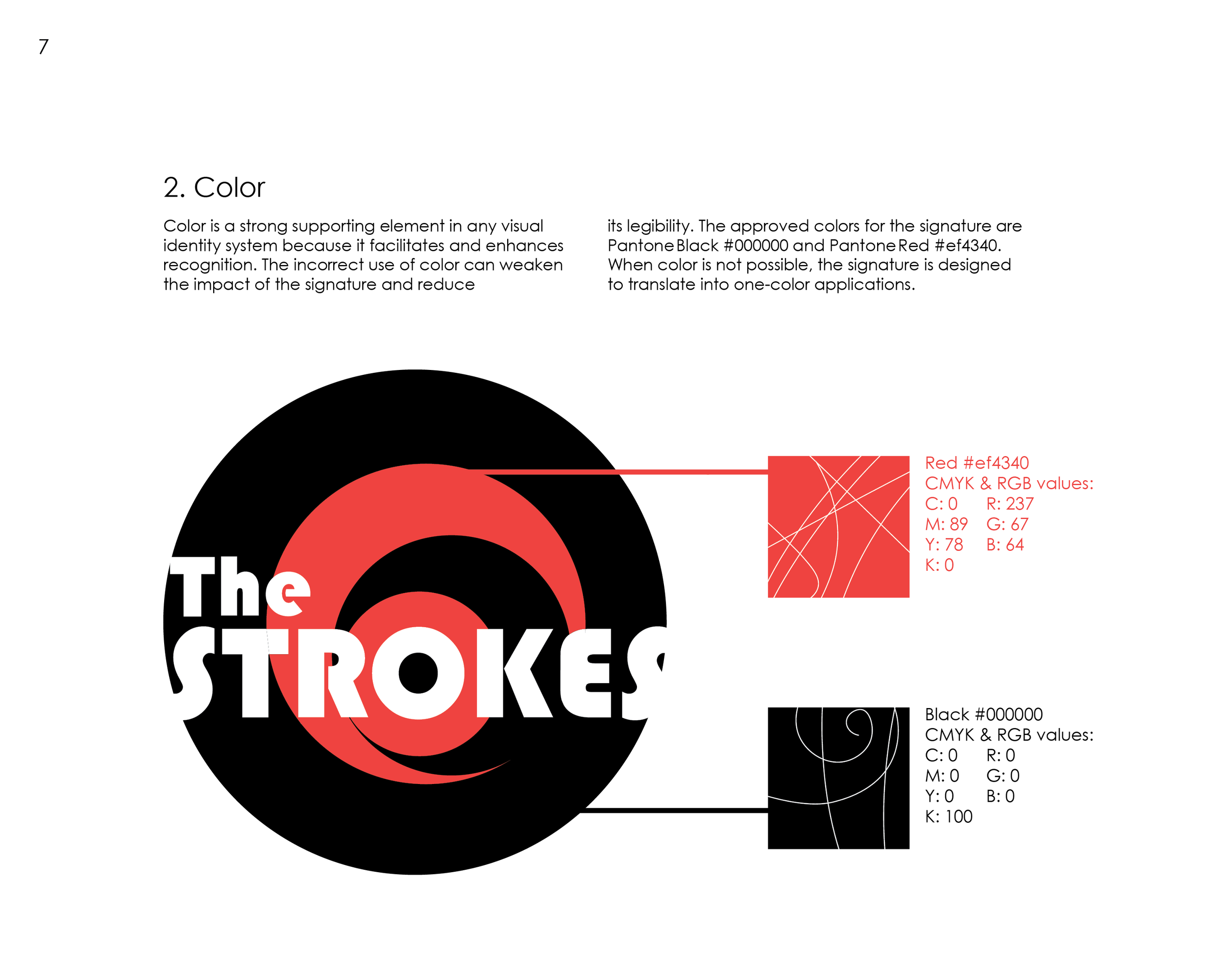
Multi-fold project aiming to re-invent the branding and cultural identity of the New York band The Strokes by creating a logo, font style, color palette, and more.
-
I began this project by doing some background research on the band and the band members. Knowing a good bit about the band from the get go helped so much of my research was focused on overall aesthetics, the way the band has evolved visually and musically, and their current branding style.
-
I began by sketching out some different logo iterations utilizing color palettes found in many of the album covers and other promotional material while trying to evoke a musical sense within the logo itself.
-
Once I settled on a logo design I felt would work well I began working on other aspects of the overall identity such as font choices and guidelines, supporting marks and sketches, and stationery such as cards and posters. Finally I summarized it all within a style guide which I then printed and binded.
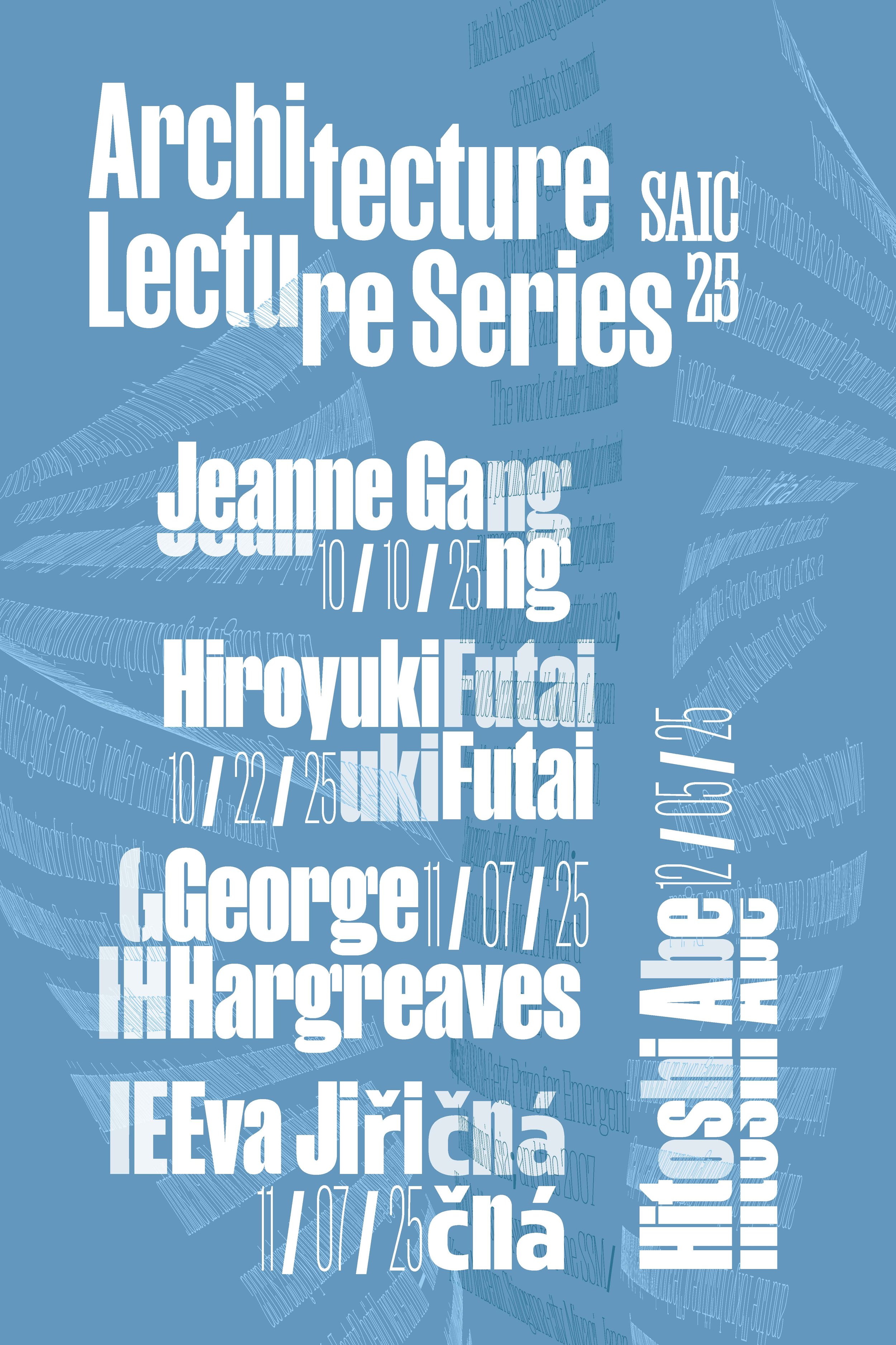
Initial Drafts:
Modular Structures Project
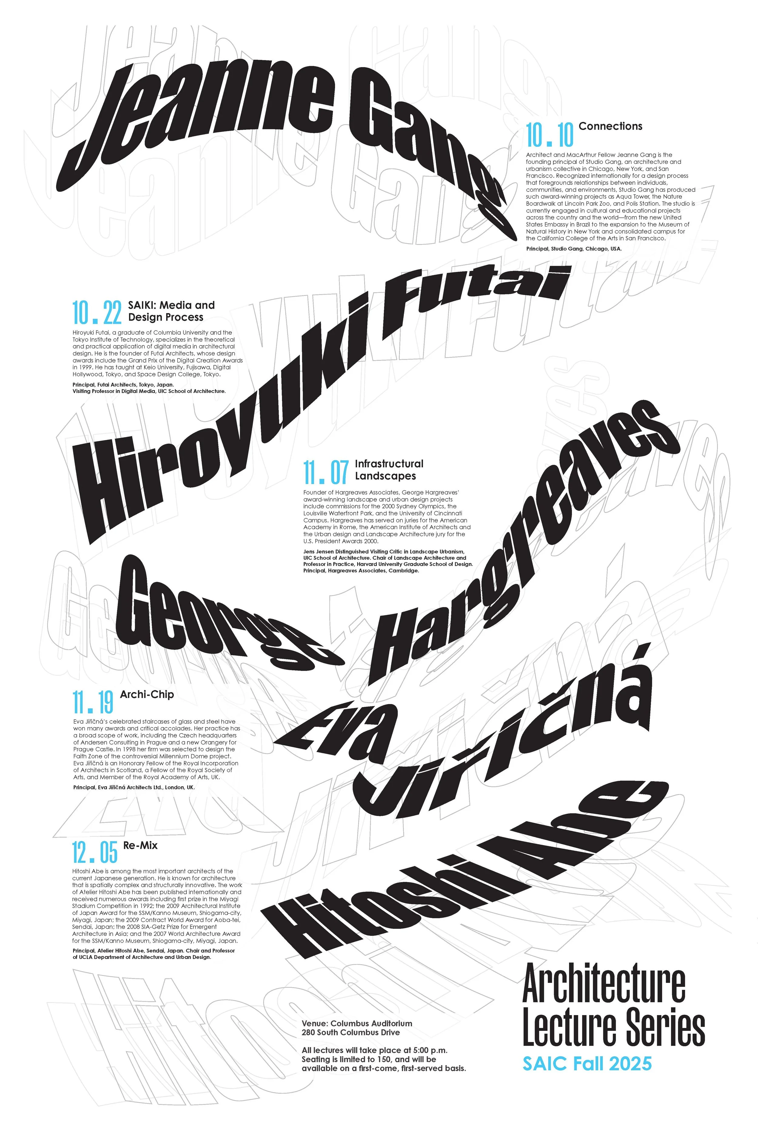
A typography based project intended to challenge the way information is displayed utilizing type in creative ways while allowing important information to shine through.
-
Below you can see an example of some of my initial font drafts playing with different fonts while trying to create interesting visualization with the text. At this point readability wasn’t my priority yet.
-
Once I had settled on the fonts I wanted to use I began actually focusing on the readability of the important information while making sure to have a clear sense of hierarchy and still having a sense of visual motion through the utilization of the text.
-
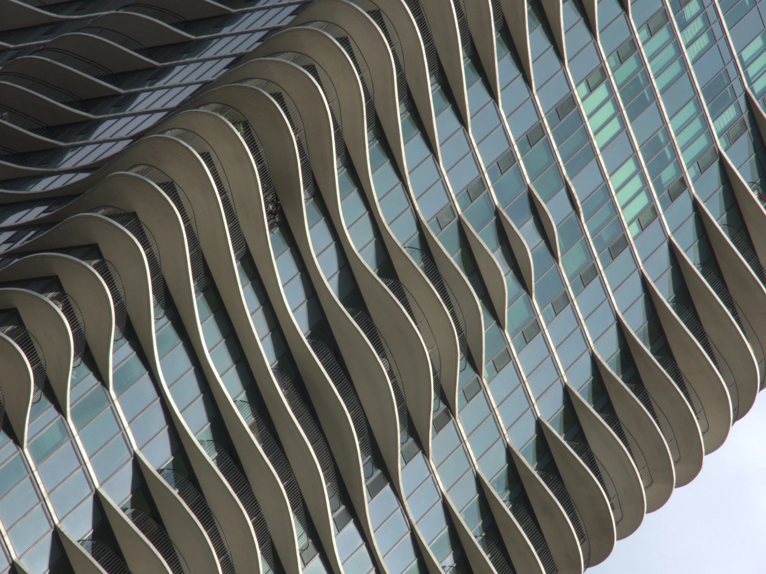
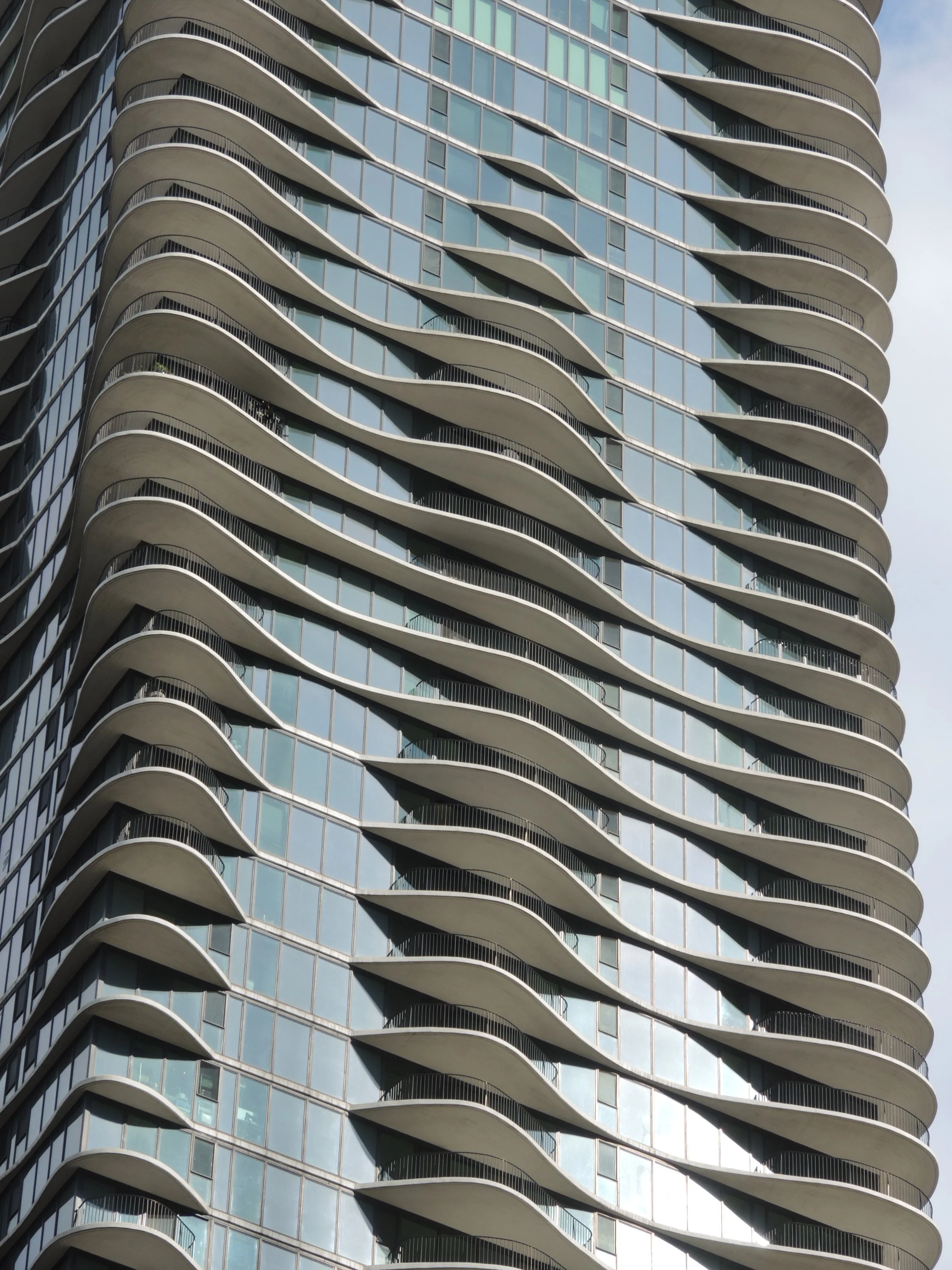
Additionally I took some supporting photography of the real building that inspired the whole project which was Jeanne Gang’s Aqua Tower in Chicago. I wanted to reference the waves created by the balconies.

Photography
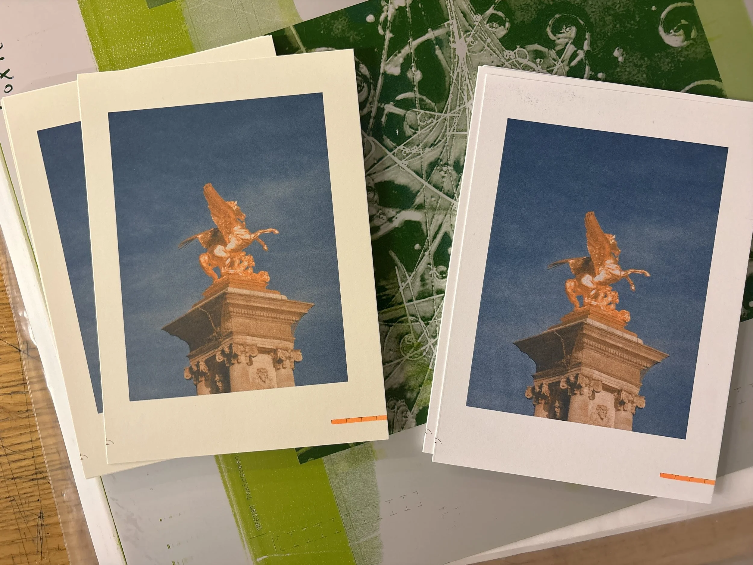
Printmaking
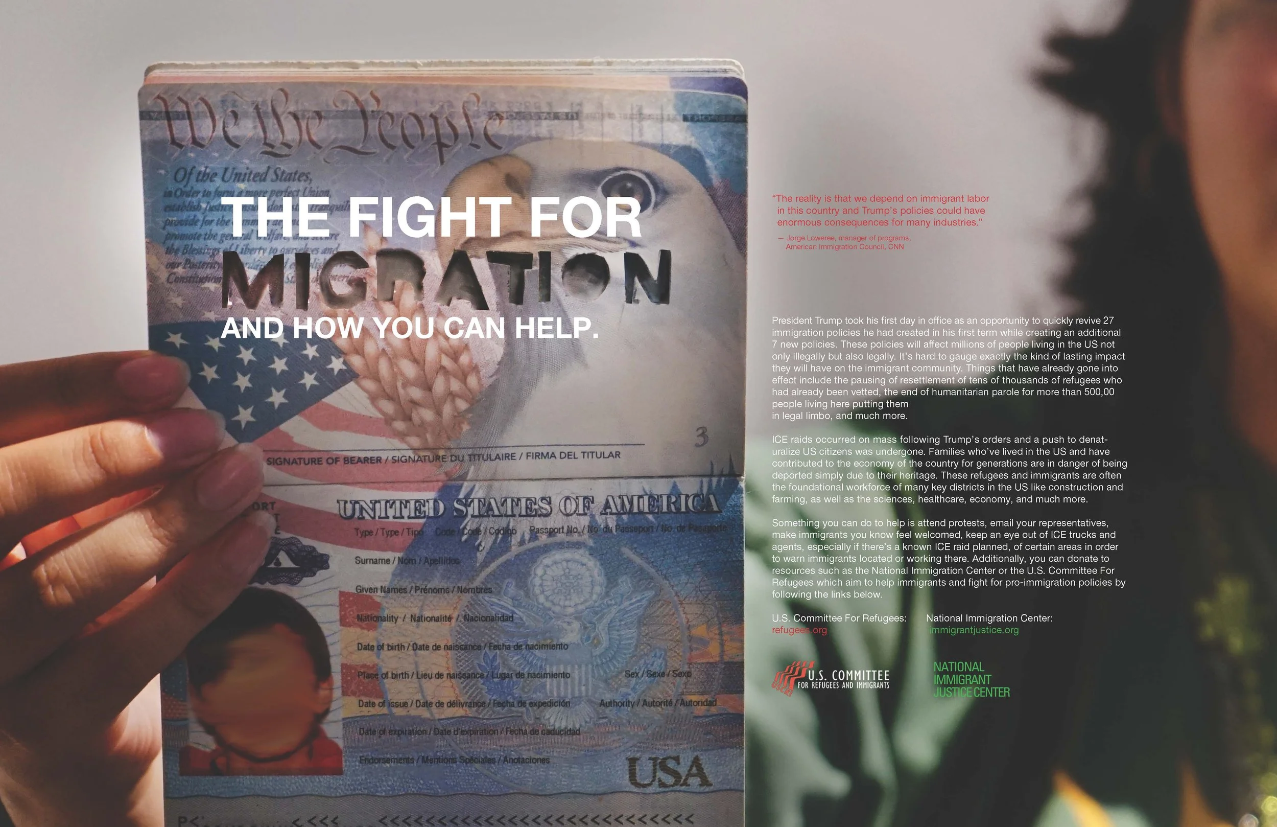
Graphic Design & Branding Work